Choosing Perfect Paint Colors: A Practical Guide for Beautiful, Cohesive Rooms
If you have ever asked, “Why did this color look amazing in the store but completely wrong at home?” you are not alone. Choosing paint is one of the highest-impact decisions in any interior design project, yet it is also one of the easiest places to make expensive mistakes. The good news is that a clear process solves most paint problems before they happen.
At FEELhaus, we help San Diego homeowners choose paint colors that feel intentional, flattering in natural light, and consistent from room to room. Whether you are refreshing one space or planning a full-home update, the framework below will help you make confident choices with less stress and better results.
Start with function before color trends
Before you open a paint deck, define what the room needs to do. Is this a calm primary bedroom, a high-energy kitchen, or a hard-working family room? Color should support how you live. A beautiful shade that fights the purpose of the room will always feel “off,” even if it is popular online.
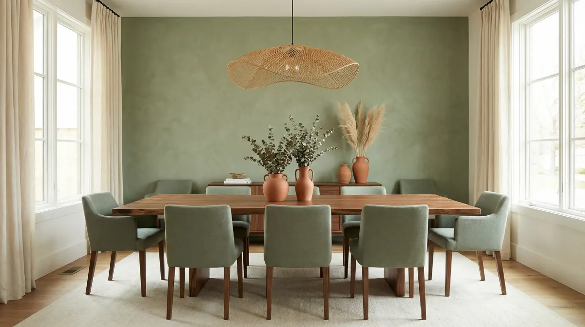
For example, clients searching for the best paint colors for open-concept living rooms usually need soft transitions, not dramatic shifts. In contrast, a powder room can often handle a richer, moodier paint because you spend less time there and can be more adventurous.
Understand undertones (this is where most mistakes happen)
Two whites can look nearly identical on a paint card and still read very differently on your wall because of undertones. Greiges may lean pink, green, or violet. Grays can pull blue in cool light. Even warm whites vary from creamy to yellow to taupe.
When homeowners ask for designer paint color consultation near me, undertone control is usually the core need. A quick rule: compare candidate colors side-by-side against a true white sheet of paper in your room. The undertone will reveal itself quickly.
Use your fixed finishes as the anchor
Flooring, countertops, tile, stone fireplaces, and cabinetry are difficult or expensive to change. Paint is flexible. That means paint should coordinate with fixed materials, not compete with them. Pull your palette from the dominant undertones in those elements first.
- Warm oak floors usually pair better with warm white or balanced greige walls.
- Cool marble with gray veining often needs cleaner whites or cooler neutrals.
- Mixed finishes can work, but only when one undertone family is clearly prioritized.
Plan a whole-home palette, even for one room
One of the most effective ways to avoid repainting is to build a small connected palette before final selection. We recommend three to five core colors: a primary wall neutral, a trim/ceiling white, and one to three support tones for accents, built-ins, or adjacent rooms.
This is especially important if you are updating a high-visibility route like entry, hallway, kitchen, and living area. Homeowners looking for how to choose paint colors for an entire house should think in sequences, not isolated rooms.
Test correctly: large samples, correct walls, real timing
Small chips are useful for elimination, not final decisions. Use peel-and-stick samples or paint large swatches (at least 18" x 18") on multiple walls in each room. Observe morning, midday, late afternoon, and evening lighting for several days.
In coastal San Diego neighborhoods, marine layer mornings can mute saturation while afternoon sun warms everything. That means the “perfect” color at 1 p.m. can feel flat by 9 a.m. Test across the full cycle before committing.
Choose sheen strategically
Sheen affects both appearance and maintenance. Matte hides wall imperfections but can mark more easily in busy homes. Eggshell is usually a balanced choice for most living areas. Satin works well in kitchens, baths, and kids’ rooms where wipeability matters. Semi-gloss remains a classic for trim and doors.
If you are comparing best paint finish for high-traffic interior walls, prioritize durability in functional zones and visual softness in rest-focused spaces.
Room-by-room paint strategy
Living room
Choose a versatile neutral with enough depth to feel intentional but not heavy. Add contrast through textiles, art, and wood tones rather than relying on dramatic wall color alone.
Kitchen
Coordinate directly with countertops, backsplash tile, and cabinet color. White paint decisions should always be tested next to these materials in natural and task lighting.
Bedroom
Look for muted, lower-contrast tones that support rest. Soft green-grays, warm taupes, and gentle mineral blues often perform beautifully when layered with natural textures.
Bathroom
Because bathrooms have fewer textiles, wall color reads stronger. Sample carefully and balance with vanity finish, tile, and metal hardware to avoid visual tension.
What to do when you are stuck between two colors
If two options are close, pick the one that harmonizes better with your fixed finishes and adjacent spaces. If one feels “cleaner” but cold and the other feels “cozier” but muddy, adjust by one step lighter or with a nearby undertone variation rather than jumping families entirely.
Still uncertain? This is exactly where a professional color consultation service saves time and money by narrowing choices before you purchase gallons of the wrong paint.
Avoid these common paint selection mistakes
- Choosing from social media screenshots without testing at home.
- Matching paint to one small décor item instead of the entire room context.
- Ignoring natural and artificial lighting changes.
- Using too many disconnected neutrals across open sightlines.
- Skipping trim and ceiling coordination.
If you want a broader checklist, read our guide to interior design mistakes homeowners should avoid before you begin.
When to bring in an interior designer
Professional guidance is most valuable when you are repainting a large portion of your home, coordinating with renovation finishes, or preparing your property for resale. A designer can align paint with space planning, furnishings, and long-term goals so your home feels cohesive-not pieced together.
If your project includes layout changes as well as finishes, explore our residential interior design service and browse recent completed spaces on our project portfolio for real-world examples.
Final takeaway
The perfect paint color is not a magic code copied from the internet-it is the result of a smart process rooted in your light, your materials, and your lifestyle. Start with function, decode undertones, test with discipline, and think in connected palettes. You will make better decisions, avoid repaint costs, and end up with rooms that feel polished for years.
Case study scenarios and practical adjustments
Consider a common scenario: a couple purchases paint, furnishings, and décor within the same week to finish quickly, then discovers the undertones conflict in evening light and the layout blocks daily movement. A better approach is staging decisions. Validate color under real lighting first, then place anchor furniture, then add supporting pieces. This sequence reduces returns and avoids spending on accessories that do not match the final direction.
Another scenario involves hybrid work routines where a dining area becomes a weekday workstation. Instead of forcing one setup to do everything poorly, plan flexible infrastructure. Use lighting that supports task focus, provide concealed cable paths, and choose chairs that are comfortable for longer sitting periods. When workday ends, a simple reset system can restore dining mode without visual clutter.
In compact urban and coastal homes, storage frequently fails because capacity was estimated by shelf count rather than by item type. Improve this by assigning storage by category: daily carry items near entries, service items near dining, seasonal items in less accessible areas, and sentimental items in clearly labeled bins. This organization structure keeps primary zones clear and reduces constant reshuffling.
Finally, build in review points. Revisit the room after two weeks, two months, and six months. At each checkpoint, identify one change that improves comfort and one change that improves maintenance. Incremental refinement makes long-form design resilient as routines shift over time.
Advanced coordination with cabinetry, stone, and flooring
When paint is selected in isolation, finishes can clash even if each element looks beautiful alone. Build a small materials board with your actual flooring sample, countertop sample, tile sample, and hardware finish. View the board in both natural and artificial light. This reveals whether your paint candidate harmonizes with the full set rather than with one element. If one finish is dominant and hard to replace, let that finish lead the undertone direction.
In renovation phases, sequence matters. If cabinetry refinishing or countertop replacement is planned within the next year, avoid locking into a paint color that only works with temporary finishes. Choose a transitional neutral that can bridge current and future states, then add personality through furnishings and art. This keeps repaint risk lower when phase-two work begins.
Move-in and touch-up strategy
Store labeled touch-up paint for every color and sheen used, and keep a placement map that lists room names and wall exposures. For high-traffic homes, schedule touch-up windows twice a year rather than waiting for many marks to accumulate. Planned maintenance preserves the crisp look of your palette and extends repaint cycles.
Neighborhood and architecture considerations in Southern California
Color that works in one neighborhood can feel out of place in another because lot spacing, vegetation, and natural light differ. Coastal homes with broad glazing often benefit from nuanced neutrals that stay balanced through shifting daylight. Inland homes with stronger direct sun may need slightly softer chroma to avoid glare amplification. Spanish-inspired, mid-century, and contemporary homes also respond differently to trim contrast and saturation. Use architecture as a guide so color choices support the home rather than compete with it.
When uncertain, test one subtle option and one slightly deeper option within the same undertone family. Compare both against furnishings and art you already own. This helps you decide whether the room needs brightness or depth without jumping across undertone families that can create visual conflict.
Need Expert Help Narrowing Paint Choices?
Our San Diego team provides in-home color strategy tailored to your lighting, finishes, and goals.
Schedule a Consultation